Some years ago I tried my hand at daytrading and more recently I had the opportunity to work with Recency Frequency Monetary models, now followed by SNMP sensor data. As it turns out, they all have something in common. They all become most valuable and interesting when you are able to discover behavior that is out of the ordinary. One can approach such detection in two ways; define abnormal and react to it or define normal and react to exceptions from it. Given that all of the mentioned subject areas are heavily skewed towards the normal, it is easier to go with the latter approach. The technique I am about to describe is influenced by Bollinger Bands, but is based on medians rather than averages, since they are less susceptible to the effects of short duration spikes.
The type of daytrading I was practicing was driven by two factors, news or indicators. The idea being that big news tend to push the market in one way or the other, but news spread asymmetrically, so there is a window of opportunity to ride the wave during the spreading if you catch it early. Big news, however, like whether to prolong quantitative easing or not, do not come on a daily basis. In order to fill the idle time, indicators can be used in a similar fashion, but on a smaller scale. The idea being that if an indicator is popular, enough trades will happen when that indicator yields a signal to cause a tradable movement. Today, this is much harder, because high frequency trading may negate an expected movement almost entirely, together with an overflow of new and exotic indicators and instruments, that obscure the view of what is popular and impair the consistency of effects. Give me any stock market chart though and I can still point out a few movements that were “not normal” in the sense that something had to drive them. A trading strategy that tries to catch abnormalities early, oblivious of the reason, may not be such a bad idea?
An RFM model consists of three attributes that are assigned to individual entities that make somewhat regular spendings. Recency indicates when the last spending was made, preferably expressed as the exact point in time when it was made. Frequency indicates the normal interval between spendings, preferably expressed as a duration in days, hours, minutes, or whatever time frame is suitable, but as precise as possible. Monetary indicates the normal size of the spending, preferably expressed as an amount in some currency, again as precise as possible. The reason the model is constructed like this is to give it predictive and indicative properties. R+F will give you the expected time of the next spending. Those who have passed that time are delayed with their spending; a good indication that they may need a reminder. Totalling F+M will give you an estimate of future revenue. Inclining or declining M may be signs of desirable and undesirable behaviour. When the distance to R is much larger than F the entity is most likely “lost”, and so on…
Large networks usually have a lot of equipment that transmit SNMP data. It may be temperature readings, battery levels, utilisation measures, congestion queues, alarms, heartbeats, and the likes. This yields a very high volume of information, and most network surveillance software only hold a very limited history of such events. They are instead rule based and react in real-time to certain events in predictable ways, such as flashing a red banner on a screen when an alarm goes off. There are two ways to deal with data that does not fit into the limited history; scrap it or store it. If you scrap it you cannot go back and analyse anything that happened outside of your window of history, which could be as short as a few days. If you store it you will need massive storages and likely even then only extend the history by a single order of magnitude. In reality though, most of your equipment is behaving normal for most of the time. What if we could decrease the granularity of the data during periods of normality and retain the details only for out of ordinary events?
If this is to be done, normal must be what we compare a current value to. A common indicator used for this purpose within daytrading is the moving average. Usually, this is average is windowed over quite a large number of measurements, such as the popular MA50 (last 50 measurements) and MA200 (last 200 measurements), which when they cross is a common trading signal. Moving averages have some downsides though and large windows do too. Let us look at a comparison of four different ways to describe normal, using MA3, MA5, MM3, and MM5, where MM are moving medians, taken on measures that alternate betweeen two values, 5 and 50, over time.
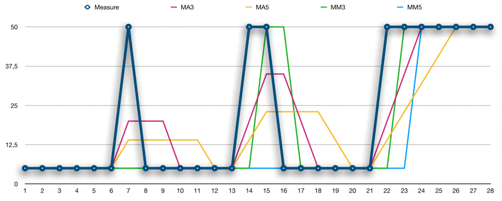
Looking at point 7 in the series, both MAs are disturbed by the peak, whereas both MMs remain at the value 5. Comparing 50 to either of the MMs or MAs would likely lead you to the conclusion that 50 is out of the ordinary, but the MMs are spot on when it comes to what is normal. What is worse is when we reach point 8. Clearly 5 is normal compared to the MMs, but the disturbances of the MAs are still lingering, so it is now difficult to say whether 5 is out of the ordinary or not. Comparing MA3 to MA5, it is obvious that a larger window will reduce the disturbance, but at the cost of extending the lingering.
Moving on to point 14 and 15, two consecutive highs, the MM3 will already at point 15 see the value 50 as the new normal, whereas MM5 will stay at 5. For MMs, the window size determines how many points out of the ordinary are needed for them to become the new normal. Quoting Ian Fleming’s Goldfinger: “Once is happenstance. Twice is coincidence. Three times is enemy action”, he has obviously adopted MM5, as seen in point 24. If we considered using MAs and extending the window size, thinking that the lingering is not too high a price to pay, another issue is seen in points 24 and 26. For MA3 it takes three points to adjust to the new normal and for MA5 it takes five points. The MMs move quicker. For these reasons, MMs will be used as the basis for describing normal behaviour.
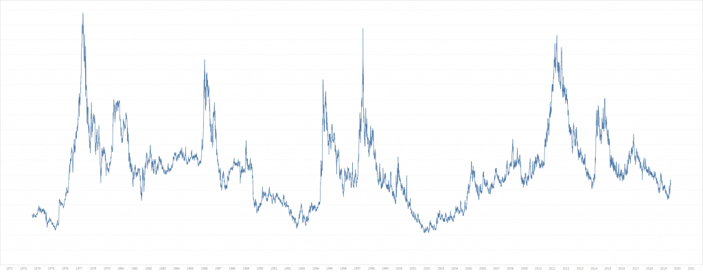
To try things out, let’s see how hard it would be to use this to condense 45 years of daily coffee prices. Coffee is one of the most volatile commodities you can trade, and there has been some significant ups and downs over the years. The data is kindly provided by MacroTrends and a graph can be seen below.
Condensing that will be much harder than the SNMP data, which is tremendously less volatile. The table holding the data is structured as follows:
create table #timeseries (
  Classification char(2),
  Timepoint date,
  Measure money,
  primary key (
    Classification,
    Timepoint desc
  )
);
Classification is here a two letter acronym making it possible to store more than just coffee (KC) prices. In the case of SNMP data, each device would have it’s corresponding Classification, so you can keep track of each individual time series. For a large network, there could be millions of time series to condense.
In a not so distance past a windowed function that can be used to calculate medians was added to SQL Server, the PERCENTILE_CONT. Unlike many other windowed functions, it does, however and sadly, not allow you specify a window size using ROWS/RANGE. We would want to specify such a size, such that the median is only calculated over the last N timepoints, as in MM3 and MM5 above. As it turns out, with a bit of trickery, it is possible to design your own window. This trick is actually useful for every aggregate that does not support the specification of a window size.
select distinct
  series.Classification,
  series.Timepoint,
  series.Measure,
  percentile_cont(0.5) within group (
    order by windowed_measures.Measure
  ) over (
    partition by series.Classification, series.Timepoint
  ) as MovingMedian
into
  #timeseries_with_mm
from
  #timeseries series
cross apply (
  select
    Measure
  from
    #timeseries window
  where
    window.Classification = series.Classification
  and
    window.Timepoint <= series.Timepoint
  order by
    Classification, Timepoint desc
  offset 0 rows
  fetch next @windowSize rows only
) windowed_measures;
Thanks to the cross apply fetching a specified number of previous rows for every Timepoint the median can be calculated as desired. If @windowSize is set to 3 we get MM3 and with 5 we get MM5. The PERCENTILE_CONT is partitioned so that we calculate the median for every Timepoint. Some rows from the #timeseries_with_mm table are shown in the table below, using MM3.
Classification Timepoint   Measure  MovingMedian
KC             1973-08-20  0,6735   0,6735
KC             1973-08-21  0,671    0,67225
KC             1973-08-22  0,658    0,671
KC             1973-08-23  0,6675   0,6675
KC             1973-08-24  0,666    0,666
KC             1973-08-27  0,659    0,666
KC             1973-08-28  0,64     0,659
Given this, comparisons can be made between a Measure and its MM3. It is possible to settle here, with some threshold for how big a difference should trigger the “out of the ordinary” detection. But, looking at the SNMP data, it’s sometimes affected by low level noise, and similarly Coffee prices have periods of higher volatility. If those, too, are normal, the detection must be fine tuned to not trigger unnecessarily often. To adjust for volatility it is possible to use the standard deviation, corresponding to the STDEVP function in SQL Server. When the volatility becomes higher the standard deviation becomes larger, so we can use this in our detection to be more lenient in periods of high volatility.
select
  series.Classification,
  series.Timepoint,
  series.Measure,
  series.MovingMedian,
  avg(windowed_measures.MovingMedian)
    as MovingAverageMovingMedian,
  stdevp(windowed_measures.MovingMedian)
    as MovingDeviationMovingMedian
into
  #timeseries_with_mm_ma_md
from
  #timeseries_with_mm series
outer apply (
  select
    MovingMedian
  from
    #timeseries_with_mm window
  where
    window.Classification = series.Classification
  and
    window.Timepoint <= series.Timepoint
  order by
    Classification, Timepoint desc
  offset 1 rows
  fetch next @trendPoints rows only
) windowed_measures
group by
  series.Classification,
  series.Timepoint,
  series.Measure,
  series.MovingMedian;
I am going to calculate the deviation not over the Measures, but over the MovingMedian, since I want to estimate how noisy the normal is. In this case I will base it on the three previous MM3 values (offset 1 and @trendPoints = 3 above). The reason for not using the current MM3 value is that it is possibly “tainted” by having included the current Measure when it is calculated. What we want is to compare the current Measure with what was previously normal, in order to tell if it’s an outlier. At the same time, it would be nice to know if Measures are trending in some direction, so once we are at it, a moving average of the three previous MM3 values is calculated. As seen above, the window trick can be used in conjunction with GROUP BY as well.
Note that three previous MM3 values require 6 previous Measures to be fully calculated. This means that in daily operations, such as for SNMP data, at least six measures must be kept to perform all calculations, but for each device the seventh and older measures can be discarded. Provided that the older measures can be condensed, this will save a lot of space.
With the new aggregates in place, left to determine is how large the fluctuations may be, before we consider them out of the ordinary. This definitely will take some tweaking, depending on your sources producing the measures, but for the Coffee prices we will settle with the following. Anything within 3.0 standard deviations is considered a non-event. In the rare case that the standard deviation is zero, which can happen if the previous three MM3 values are all equal, we circumvent even the smallest change to trigger an event by also allowing anything within 3% of the moving average. Using these, a tolerance band is calculated and a Measure outside it is deemed out of the ordinary.
-- accept fluctuations within 3% of the average value
declare @averageComponent float = 0.03;
-- accept fluctuations up to three standard deviations
declare @deviationComponent float = 3.0;

select
  Classification,
  Timepoint,
  Measure,
  Trend,
  case
    when outlier.Trend is not null
    then (Measure - MovingMedian) / (Measure + MovingMedian)
  end as Significance,
  margin.Tolerance,
  MovingMedian
into
  Measure_Analysis
from
  #timeseries_with_mm_ma_md
cross apply (
  values (
    @averageComponent * MovingAverageMovingMedian +
    @deviationComponent * MovingDeviationMovingMedian
  )
) margin (Tolerance)
cross apply (
  values (
    case
      when Measure < MovingMedian - margin.Tolerance then '-'
      when Measure > MovingMedian + margin.Tolerance then '+'
    end
  )
) outlier (Trend)
order by
  Classification,
  Timepoint desc;
If the Measure is larger, the trend is positive and negative if it is lower. Events that are deemed out of the ordinary may be so by a small amount or by a large amount. To determine the magnitude of an event, we will use the CHOAS metric. It provides us with a number that becomes larger (positive or negative) as the difference between the Measure and the MovingMedian grows.
Finally, keep the rows that are now marked as outliers (Trend is positive or negative) along with the previous row and following row. The idea is to increase the resolution/granularity around these points, and skip the periods of normality, replacing these with inbound and outbound values.
select
  Classification,
  Timepoint,
  Measure,
  Trend,
  Significance
into
  Measure_Condensed
from (
  select
    trending_and_following_rows.Classification,
    trending_and_following_rows.Timepoint,
    trending_and_following_rows.Measure,
    trending_and_following_rows.Trend,
    trending_and_following_rows.Significance
  from
    Measure_Analysis analysis
  cross apply (
    select
      Classification,
      Timepoint,
      Measure,
      Trend,
      Significance
    from
      Measure_Analysis window
    where
      window.Classification = analysis.Classification
    and
      window.Timepoint >= analysis.Timepoint
    order by
      Classification,
      Timepoint asc
    offset 0 rows
    fetch next 2 rows only
  ) trending_and_following_rows
  where
    analysis.Trend is not null
  union
  select
    trending_and_preceding_rows.Classification,
    trending_and_preceding_rows.Timepoint,
    trending_and_preceding_rows.Measure,
    trending_and_preceding_rows.Trend,
    trending_and_preceding_rows.Significance
  from
    Measure_Analysis analysis
  cross apply (
    select
      Classification,
      Timepoint,
      Measure,
      Trend,
      Significance
    from
      Measure_Analysis window
    where
      window.Classification = analysis.Classification
    and
      window.Timepoint <= analysis.Timepoint
    order by
      Classification,
      Timepoint desc
    offset 0 rows
    fetch next 2 rows only
  ) trending_and_preceding_rows
  where
    analysis.Trend is not null
  union
  select
    analysis.Classification,
    analysis.Timepoint,
    analysis.Measure,
    analysis.Trend,
    analysis.Significance
  from (
    select
      Classification,
      min(Timepoint) as FirstTimepoint,
      max(Timepoint) as LastTimepoint
    from
      Measure_Analysis
    group by
      Classification
  ) first_and_last
  join
    Measure_Analysis analysis
  on
    analysis.Classification = first_and_last.Classification
  and
    analysis.Timepoint in (
      first_and_last.FirstTimepoint,
      first_and_last.LastTimepoint
    )
) condensed;
The code needs to manage the first and last row in the timeseries, which may not be trending in either direction, but needs to be present in order to produce a nice graph. This will reduce the Coffee prices table from 11 491 to 884 rows. That this was harder than for SNMP data is shown by the “compression ratio”, which in this case is approximately 1:10, but for SNMP reached 1:1000. The condensed graph can be seen below.
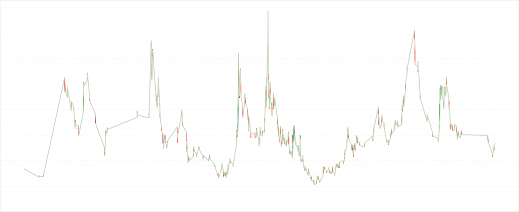
Colors are deeper red for negative Significance and deeper green for positive Significance. What is interesting is that Coffee seems to have periods that are uneventful and other periods that are much more eventful. These periods last years. Of course, trading is more fun when the commodity is eventful, and unfortunately it seems as if we are in an uneventful period right now.
In this article, code has been optimized for readability and not for performance. Coffee may not have been the best example from a condensability perspective, but it has some interesting characteristics and its price history is freely available. There are surely other ways to do this and the method presented here can likely be improved, so I would be very happy to receive comments along those lines.
The complete code can be found by clicking here.
Datatypes for PostgreSQL are not proper. It very hard to change it manually. Any plan to fix this issue